We’re excited to introduce a set of prompts for creators of all types! Meet WordPrompt, a single-word monthly exercise that aims to inspire you to create new posts, regardless of what or how you publish.
Mindy Postoff
Earlier this year, we kicked off 2022 with Bloganuary, a daily blogging challenge during the month of January. The feedback we received about the challenge was overwhelmingly positive, and it’s clear that prompts serve as a helpful way to inspire people to write and to connect with other bloggers.
We want to keep that momentum going, so we’re excited to introduce a new set of prompts for creators of all types — whether they participated in Bloganuary or not. Meet WordPrompt, a single-word monthly exercise that aims to inspire you to create new posts, regardless of what or how you publish.
Are you a food blogger sharing recipes? We challenge you to cook up something interesting based on an individual word.
Are you a photographer with an online portfolio? Show us how the prompt is represented in picture form.
Do you host a podcast or a vlog? We’d love to witness how a single word inspires an episode.
Whatever you publish, we hope you find inspiration in WordPrompts. To join in on the fun, add “WordPrompt” as a tag to your post, allowing your content to be discovered more easily in the Reader, and use the hashtag #WordPrompt when you share your post on social media.
This month’s WordPrompt is:
GREEN
You can find new WordPrompts on our social channels and in our newsletter each month, so be sure to follow us and/or enable the newsletter emails in your account to participate!
Our mission has always been to democratize publishing, one website at a time. Now we’re making all the benefits of WordPress available to more people, with one simple pricing plan.
Hello, Pro
One thing we heard over the years was how hard it can be to choose the right upgrade plan when you’re ready to scale up from Free.
WordPress Pro radically simplifies that decision by rolling the very best of managed WordPress hosting into a single, affordable plan at just $15/month (paid annually).
50,000+ Plugins in Your Pocket
Plugins are powerful add-ons that make it simple to add limitless functionality to your website in just a few clicks. No coding necessary. With WordPress Pro we’re opening the doors to this unlimited array of extra features at half the price of our previous Business plan.
A Universe of Beautifully Designed Themes
Along with thousands of free themes available, Pro also unlocks a range of beautiful, Premium themes, with more to come in the future. Whatever your goals, you’ll find a hand-crafted, flexible theme to transform your design in minutes, not months. No designer necessary.
From Site to Store in a Couple of Clicks
If you’re ready to start selling, WordPress Pro includes everything from simple payments, donations, and subscriptions, to full-blown stores.
WooCommerce – one of the most popular ecommerce platforms on the planet – is baked into your Pro plan. Not only does that bring raw, almost infinitely expandable options to your store, it also means you’ll pay significantly less than those other e-commerce options you see in ads everywhere.
Anytime Support, Any Time You Need It
Sometimes you need a little extra help getting it done. WordPress Pro customers can get a helping, human hand with Premium Support over live chat and email. If you’re stuck, we’re here to get you unstuck.
Managed WordPress Hosting For the Rest of Us
WordPress is all about the right to do it yourself.
With cheap hosting, or even a Raspberry Pi on your counter, you can put up a site in minutes for pocket change. But you’ll run into hours of hands-on maintenance, quickly hit speed, security, and hosting limits, and spend a significant amount of your time keeping it running. Managed Hosting takes away that pain, but often at a significantly higher price.
WordPress.com and the new WordPress Pro plan aim to give you the raw power, flexibility, and hassle-free experience of Managed Hosting, without the huge price tag that usually comes with it.
In addition to the headline features of Pro, you’ll get:
Custom domain names without a separate subscription
SEO features that make your site easy to find.
Social media tools to promote your website.
Hyper-secure protection from DDOS, brute force, and other attacks that could take your site down overnight
Super-strong, real-time, automated backups spanning multiple locations, so if the worst ever happens, you’re covered
That means you’ll enjoy a fast, secure, search optimized site, without having to spend countless hours on updates, fixes, and technical maintenance.
What About Free?
Our Free plan isn’t going away.
It’s important to WordPress.com that anyone, anywhere can put up a blog or a site, whatever their situation. With the Free plan you’ll still be able to get the word out, create a beautiful site, and take advantage of the fastest WordPress managed hosting on the planet. And when you’re ready to scale up your ambitions, WordPress Pro will be waiting in the wings.
How This Affects Your Current Plan
While we’re making a few changes to the Free plan, rest assured that if you’re already signed up, nothing will change for you. Ditto, if you’re on one of our legacy plans, nothing will change unless you want it to.
Going forward, new signups and sites will integrate smoothly into our new Free and Pro plans.
Your Money Goes Further. And Further.
WordPress Pro is more than just a simple, competitive way to enjoy rock-solid, super-fast, hyper secure WordPress hosting without the hassle.
Every dollar you spend on your plan helps us to:
Support WordPress.com Free plan users around the world, whatever their circumstances. This is more important than ever in 2022.
Sponsor the work of 90+ dedicated developers working on the free, open source WordPress project as part of the Five for the Future initiative. That helps to ensure that WordPress will always be free, open, adaptable, and hostable by anyone.
We’re Here For You
We’re listening to your feedback, and want to be clear that it will, as always, shape the future of WordPress.com.
With that in mind, we’re committing to:
No traffic limits on either the Free or Pro plan. You’ll enjoy the same unlimited traffic you’ve always had.
The new Free plan storage limit will include 1GB of Free storage, and existing Free users will keep the 3GB they already have on hand.
Additional storage will be available for purchase at a very reasonable price, very soon.
As-you-need them add-ons for both plans, to give you a la carte upgrades. Coming soon.
It’s important that we keep things simple, honest, and clear in everything we do, and we’re looking forward to hearing from you about your plans, feedback, and ideas!
More Questions?
We totally understand that you might have additional questions about the changes. We’ve answered more of your questions in our FAQ here.
Welcome back to our “WordPress.com Favorites” series! In these interviews, we’ll be highlighting bloggers about their passion project. Caution: contents guaranteed to be inspiring. This interview has been lightly edited.
Shortly after Empish Thomas earned her journalism degree in the mid-’90s, she began experiencing severe headaches and sensitivity to light. After a visit to the eye doctor, she was diagnosed with uveitis, a generalized eye inflammation that can quickly escalate to permanent damage. Unfortunately, Empish fell into that category, losing her sight fully within a few years.
Since then, she’s been a writer, journalist, and advocate for blindness and disability rights, telling stories and championing awareness along the way.
Empish generously took the time to answer a few of my questions and share some ideas on how we can all be better advocates for disability rights.
1. Tell us a little bit about yourself. What do you write about and why? How long have you been blogging?
I am a freelance writer and blogger. I started off as a writer many years ago and later started blogging in 2013. Although I have a journalism degree, I love writing for the pure pleasure of it. I launched my own blog about two years ago as a safe place to write my own thoughts and ideas about things that concerned me. I write especially about my life as a blind person because when I became disabled 20+ years ago, I rarely saw positive and interesting stories about the disabled.
2. What are some of the most common negative portrayals you see about folks with disabilities in the news or in pop culture?
Well, there are actually two things I notice. One is the “superhero crip” image. That is a disabled person overcoming these incredible challenges and doing amazing things that everyone is impressed by. It sends a message that all disabled people are supposed to or want to be that way. It communicates a false expectation. At the end of the day, we are all human beings and live lives like everyone else.
The second one is that we are not visible at all. Many times, I will read a story or watch a news segment and wonder, “Where are the blind people? What is happening to those with disabilities?” This is not necessarily a negative thing, but more [shows our] exclusion from the storyline.
3. Let’s move to the workplace. How can employers become better allies and advocates for disability rights?
First, making sure that disabled employees get their accommodations to perform their jobs.
Then, providing the support, encouragement, and motivation to help them move upward in the company the way you would an abled-bodied person. Sometimes I think that people with disabilities are not encouraged to move up into management or higher-level positions. It is like people can’t imagine a blind person as a supervisor or director. But with the right support, they could do the job like anyone else.
A Few of Empish’s Favorite Posts:
4. You’ve mentioned podcasts in a number of blog posts. Do you have any favorite listening experiences to recommend?
Yes, some of my favorite podcasts are HISTORY This Week, LeVar Burton Reads, The Stacking Benjamins, Code Switch, and Grammar Girl.
5. What can someone do today to be a better advocate for disability rights, especially in the online space?
For me, being a better advocate is learning as much as you can about blindness and visual impairment. Reading things written by disabled people in their own voices. Through my years of writing about the disabled, I have had people reach out to me to learn more and that is a good thing.
Also, helping those of us with visual disabilities get access to the internet. I can’t begin to tell you the number of websites I go to with accessibility issues. It is a regular challenge. Reaching out to web developers is hard and exhausting sometimes. But having allies to help in this process would be wonderful. It could be a simple thing like bringing awareness, because people don’t think that blind people are online.
6. Do have any tips for aspiring bloggers or freelance writers?
Depending on the type of blog you are writing, it is so important to be organized. I use an editorial calendar where I jot down blog ideas for each month. I think about things coming up, current events, trending topics, etc., and add them to the calendar. This helps me to keep a good flow of blog posts.
Once people start subscribing they expect to see posts on a regular basis, and having an editorial calendar helps me stay on track.
Want to learn more about being organized and consistent with your writing? Sign up for our free, self-guided Intro to Blogging course today:
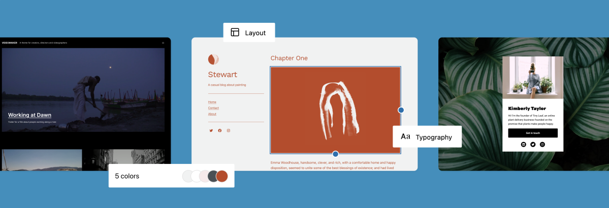
Experiment with a new look for your site with themes created to take advantage of Full Site Editing.
Kjell Reigstad
In case you missed it, we’ve been rolling out a new set of powerful site design tools called Full Site Editing (or “FSE”) and it’s now available for all WordPress.com users!
Don’t worry if you’re just hearing about Full Site Editing for the first time. We’ve been releasing these new tools in a way that doesn’t actually require you to do anything with your existing site(s). If you are up for a change though, we’re happy to announce the launch of a brand new family of themes made specifically with Full Site Editing features in mind. As of this writing we have over two dozen themes available that support Full Site Editing.
These new themes have been designed with a wide variety of sites cases in mind. But their potential stretches well beyond their screenshots and demo sites. Because each theme is fully editable in the Site Editor, every one of these themes can be heavily customized to fit your site’s needs. You can start with theme that features single minimalist homepage, and then add as many menus and sidebars as you wish. Or, you can start with a complex business theme and strip it down to something minimal to suit your vision.
The Site Editor also includes a new feature called “Global Styles,” which allows you to edit site-wide settings for color, typography, and more. You’re free to change your theme’s default color scheme to whatever fits your mood, or even make all site text larger or smaller in a couple of clicks. To kick off this new feature, we’re also providing a few pre-built variations on some of these new themes.
All the new themes and variations can be found in the Theme Showcase. Or, if you’re starting a fresh site, they’ll be offered to you automatically in the site creation flow. This collection of themes is just the beginning, and we’re excited to continue launching a variety of diverse theme options for you. What would you like to see in the next set of themes on WordPress.com?
Google Analytics is powerful analytics software. A common way to use it is to just slap the JavaScript snippet on every page template you have and let it collect basic data about unique visitors and pageviews and such. That’s useful, but it’s also the bare minimum. Say there is an important button on your site. Leveling up, you could send custom events to track users clicking on that button. Those are the analytics that matter the most.
Further down that road is tracking eCommerce analytics. This is extra-tricky, as it requires you sending events to Google Analytics for sales, instances of adding/removing things from cart, views on products… all sorts of stuff. If you don’t do all that (and do it right), you don’t get good analytics information.
Yet another reason I like WooCommerce! Instead of this analytics integration being a monumental effort and a substantial bit of technical debt to maintain, you just install the WooCommerce Google Analytics plugin and… that’s it. Also: it’s free.
I’ve had this integrated for months right here on CSS-Tricks, and I can confirm:
It was close to zero effort.
It just works.
The plugin installed and activated! The one bit of config is adding this ID, which is easy to find in Google Analytics, your own code, or another Google Analytics plugin.
Now, to be clear, WooCommerce has its own analytics built right in. If what you are interested in is sales reports and top sellers and stuff like that, those are the dashboards I’d be looking at. But there are some things that the built-in WooCommerce analytics just don’t do. For example, I can check out the sales funnel on Google Analytics now:
30 days of traffic starting from all unique visitors to sessions where they actually bought something.
CSS-Tricks isn’t exactly an eCommerce-focused website, so the funnel there starts super wide and gets super (super) tiny — but hey, at least I can confirm that and see it with my own eyes. Plus, I can glean some insights here, like the fact that 66/70 people completed checkout once they got there (pretty good), but only 70/525 even proceeded to checkout after adding to cart, so I’m losing a lot of people at that stage.
Here is some more interesting data that only Google Analytics knows:
Of 66 sales, 56 of them came from returning visitors, not new visitors. So people tend to not buy on first look, but do come back later. I’m not sure if that means I should be making things more enticing for those new visitors or if I should lean into reminding people about it after they’ve looked at it. Either way, now I know because I have the data.
There is data in the WooCommerce analytics that I’d normally have to go to Google Analytics to see. I can see individual orders. I can see what the top sellers are and compare product sales over different time periods. All useful stuff, and you might appreciate having all this in one place.
Again, my favorite part about this is having all this data. It feels like it should have been hard-won to get, but all it took was clicking a few buttons. That’s why I never regret just doing things the standard WordPress and WooCommerce way! Things tend to just work!
I believe that a traditional WordPress theme should be able to work as effectively as a static site or a headless web app. The overwhelming majority of WordPress websites are built with a good ol’ fashioned WordPress theme. Most of them even have good caching layers, and dependency optimizations that make these sites run reasonably fast. But as developers, we have accomplished ways to create better results for our websites. Using a headless WordPress has allowed many sites to have faster load speeds, better user interactions, and seamless transitions between pages.
The problem? Maintenance. Let me show you another possibility!
Let’s start by defining what I mean by “Traditional” WordPress, “Headless” WordPress, and then “Nearly Headless” WordPress.
Traditional WordPress websites
Traditionally, a WordPress website is built using PHP to render the HTML markup that is rendered on the page. Each time a link is clicked, the browser sends another request to the server, and PHP renders the HTML markup for the site that was clicked.
This is the method that most sites use. It’s the easiest to maintain, has the least complexity in the tech, and with the right server-side caching tools it can perform fairly well. The issue is, since it is a traditional website, it feels like a traditional website. Transitions, effects, and other stylish, modern features tend to be more difficult to build and maintain in this type of site.
Pros:
The site is easy to maintain.
The tech is relatively simple.
There is great compatibility with WordPress plugins.
Cons:
Your site may feel a little dated as society expects app-like experiences in the browser.
JavaScript tends to be a little harder to write and maintain since the site isn’t using a JavaScript framework to control the site’s behavior.
Traditional websites tend to run slower than headless and nearly headless options.
Headless WordPress websites
A headless WordPress website uses modern JavaScript and some kind of server-side RESTful service, such as the WordPress REST API or GraphQL. Instead of building, and rendering the HTML in PHP, the server sends minimal HTML and a big ol’ JavaScript file that can handle rendering any page on the site. This method loads pages much faster, and opens up the opportunity to create really cool transitions between pages, and other interesting things.
No matter how you spin it, most headless WordPress websites require a developer on-hand to make any significant change to the website. Want to install a forms plugin? Sorry, you probably need a developer to set that up. Want to install a new SEO plugin? Nope, going to need a developer to change the app. Wanna use that fancy block? Too bad — you’re going to need a developer first.
Pros:
The website itself will feel modern, and fast.
It’s easy to integrate with other RESTful services outside of WordPress.
The entire site is built in JavaScript, which makes it easier to build complex websites.
Cons:
You must re-invent a lot of things that WordPress plugins do out of the box for you.
This set up is difficult to maintain.
Compared to other options, hosting is complex and can get expensive.
See “WordPress and Jamstack” for a deeper comparison of the differences between WordPress and static hosting.
I love the result that headless WordPress can create. I don’t like the maintenance. What I want is a web app that allows me to have fast load speeds, transitions between pages, and an overall app-like feel to my site. But I also want to be able to freely use the plugin ecosystem that made WordPress so popular in the first place. What I want is something headless-ish. Nearly headless.
I couldn’t find anything that fit this description, so I built one. Since then, I have built a handful of sites that use this approach, and have built the JavaScript libraries necessary to make it easier for others to create their own nearly headless WordPress theme.
Introducing Nearly Headless WordPress
Nearly headless is a web development approach to WordPress that gives you many of the app-like benefits that come with a headless approach, as well as the ease of development that comes with using a traditional WordPress theme. It accomplishes this with a small JavaScript app that will handle the routing and render your site much like a headless app, but has a fallback to load the exact same page with a normal WordPress request instead. You can choose which pages load using the fallback method, and can inject logic into either the JavaScript or the PHP to determine if the page should be loaded like this.
You can see this in action on the demo site I built to show off just what this approach can do.
For example, one of the sites implementing this method uses a learning management system called LifterLMS to sell WordPress courses online. This plugin has built-in e-commerce capabilities, and sets up the interface needed to host and place course content behind a paywall. This site uses a lot of LifterLMS’s built-in functionality to work — and a big part of that is the checkout cart. Instead of re-building this entire page to work inside my app, I simply set it to load using the fallback method. Because of this, this page works like any old WordPress theme, and works exactly as intended as a result — all without me re-building anything.
Pros:
This is easy to maintain, when set-up.
The hosting is as easy as a typical WordPress theme.
The website feels just as modern and fast as a headless website.
Cons:
You always have to think about two different methods to render your website.
There are limited choices for JavaScript libraries that are effective with this method.
This app is tied very closely to WordPress, so using third party REST APIs is more-difficult than headless.
How it works
For something to be nearly headless, it needs to be able to do several things, including:
load a page using a WordPress request,
load a page using JavaScript,
allow pages to be identical, regardless of how they’re rendered,
provide a way to know when to load a page using JavaScript, or PHP, and
Ensure 100% parity on all routed pages, regardless of if it’s rendered with JavaScript or PHP.
This allows the site to make use of progressive enhancement. Since the page can be viewed with, or without JavaScript, you can use whichever version makes the most sense based on the request that was made. Have a trusted bot crawling your site? Send them the non-JavaScript version to ensure compatibility. Have a checkout page that isn’t working as-expected? Force it to load without the app for now, and maybe fix it later.
To accomplish each of these items, I released an open-source library called Nicholas, which includes a pre-made boilerplate.
Keeping it DRY
The biggest concern I wanted to overcome when building a nearly-headless app is keeping parity between how the page renders in PHP and JavaScript. I did not want to have to build and maintain my markup in two different places — I wanted a single source for as much of the markup as possible. This instantly limited which JavaScript libraries I could realistically use (sorry React!). With some research, and a lot of experimentation, I ended up using AlpineJS. This library kept my code reasonably DRY. There’s parts that absolutely have to be re-written for each one (loops, for example), but most of the significant chunks of markup can be re-used.
A single post template rendered with PHP might look like something like this:
Both of them use the same PHP template, so all of the code inside the actual loop is DRY:
$title   = $template->get_param( 'title', '' );

// Get the title that was passed into this template, fallback to empty string.
$content = $template->get_param( 'content', '' ); // Get the cotent passed into this template, fallback to empty string.

?>
<article x-data="theme.Post(index)">
  <!-- This will use the alpine directive to render the title, or if it's in compatibility mode PHP will fill in the title directly -->
  <h1 x-html="title"><?= $title ?></h1>
  <!-- This will use the Alpine directive to render the post content, or if it's in compatibility mode, PHP will fill in the content directly -->
  <div class="content" x-html="content"><?= $content ?></div>
</article>
Detect when a page should run in compatibility mode
“Compatibility mode” allows you to force any request to load without the JavaScript that runs the headless version of the site. When a page is set to load using compatibility mode, the page will be loaded using nothing but PHP, and the app script never gets enqueued. This allows “problem pages” that don’t work as-expected with the app to run without needing to re-write anything.
There are several different ways you can force a page to run in compatibility mode — some require code, and some don’t. Nicholas adds a toggle to any post type that makes it possible to force a post to load in compatibility mode.
Along with this, you can manually add any URL to force it to load in compatibility mode inside the Nicholas settings.
These are a great start, but I’ve found that I can usually detect when a page needs to load in compatibility mode automatically based on what blocks are stored in a post. For example, let’s say you have Ninja Forms installed on your site, and you want to use the validation JavaScript they provide instead of re-making your own. In this case, you would have to force compatibility mode on any page that has a Ninja Form on it. You could manually go through and add each URL as you need them, or you can use a query to get all of the content that has a Ninja Forms block on the page. Something like this:
That automatically adds any page with a Ninja Forms block to the list of URLs that will load using compatibility mode. This is just using WP_Query arguments, so you could pass anything you want here to determine what content should be added to the list.
Extending the app
Under the hood, Nicholas uses a lightweight router that can be extended using a middleware pattern much like how an Express app handles middleware. When a clicked page is routed, the system runs through each middleware item, and eventually routes the page. By default, the router does nothing; however, it comes with several pre-made middleware pieces that allows you to assemble the router however you see-fit.
A basic example would look something like this:
// Import WordPress-specific middleware
import {
  updateAdminBar,
  validateAdminPage,
  validateCompatibilityMode
} from 'nicholas-wp/middlewares'

// Import generic middleware
import {
  addRouteActions,
  handleClickMiddleware,
  setupRouter,
  validateMiddleware
} from "nicholas-router";

// Do these actions, in this order, when a page is routed.
addRouteActions(
  // First, validate the URL
  validateMiddleware,
  // Validate this page is not an admin page
  validateAdminPage,
  // Validate this page doesn't require compatibility mode
  validateCompatibilityMode,
  // Then, we Update the Alpine store
  updateStore,
  // Maybe fetch comments, if enabled
  fetchComments,
  // Update the history
  updateHistory,
  // Maybe update the admin bar
  updateAdminBar
)

// Set up the router. This also uses a middleware pattern.
setupRouter(
  // Setup event listener for clicks
  handleClickMiddleware
)
From here, you could extend what happens when a page is routed. Maybe you want to scan the page for code to highlight, or perhaps you want to change the content of the <head> tag to match the newly routed page. Maybe even introduce a caching layer. Regardless of what you need to-do, adding the actions needed is as simple as using addRouteAction or setupRouter.
Next steps
This was a brief overview of some of the key components I used to implement the nearly headless approach. If you’re interested in going deeper, I suggest that you take my course at WP Dev Academy. This course is a step-by-step guide on how to build a nearly headless WordPress website with modern tooling. I also suggest that you check out my nearly headless boilerplate that can help you get started on your own project.
This post was in progress before Automattic acquired Frontity and its entire team. According to Frontity’s founders, the framework will be transitioned into a community-led project and leave the project in “a stable, bug-free position” with documentation and features. Like other open-source community projects, Frontity will remain free as it has been, with opportunities to contribute to the project and make it an even better framework for decoupled WordPress. More detail is found in this FAQ page.
In my previous article, we created a headless WordPress site with Frontity and briefly looked at its file structure. In this companion article, we will go into a deep dive of the @frontity/mars-theme package, or Mars Theme, with a step-by-step walkthrough on how to customize it to make our own. Not only is the Mars Theme a great starter, it’s Frontity’s default theme — sort of like WordPress Twenty Twenty-One or the like. That makes it a perfect starting point for us to get hands-on experience with Frontity and its features.
Specifically, we will look at the fundamental parts of Frontity’s Mars Theme, including what they call “building blocks” as well as the different components that come with the package. We’ll cover what those components do, how they work, and finally, how styling works with examples.
Let’s revisit the file structure of the Frontity project we made in the last article as that shows us exactly where to find Frontity’s building blocks, the frontity.settings.js, and package.json and packages/mars-theme folder. We covered these is great detail before but, in particular, the package.json file gives us a lot of information about the project, like the name, description, author, dependencies, etc. Here’s what that file includes:
frontity: this is the main package that includes all the methods used in Frontity app development. It’s also where the CLI lives.
@frontity/core: This is the most important package because it takes care of all the bundling, rendering, merging, transpiling, serving, etc. We don’t need to access to it in order to develop a Frontity app. The full list is captured in the Frontity docs.
@frontity/wp-source:This package connects to the WordPress REST API of our site and fetches all the data needed in the Mars Theme.
@frontity/tiny-router:This package handles window.history and helps us with routing.
@frontity/htmal2react:This package converts HTML to React, working with processors that match HTML portions while replacing them with React components.
Frontity core, or @frontity/package (also referred as Frontity’s building block), is composed of useful React component libraries in its @frontity/components package, which exports helpful things like Link, Auto Prefetch, Image, Props, Iframe, Switch, and other functions, objects, etc., that can be directly imported into Frontity project components. A more detailed description of these components—including syntax info use cases—is in this package reference API.
When starting frontity, all the packages defined in frontity.settings.js are imported by @frontity/file-settings and the settings and exports from each package are merged by @frontity/core into a single store where you can access the state and actions of the different packages during development using @frontity/connect, the frontity state manager.
Next up, we’re familiarizing ourselves with how these building blocks, utilities and exports are used in the Mars Theme package to create a functioning Frontity project with a headless WordPress endpoint.
Section 1: Digging into the Mars Theme
Before discussing styling and customizing let’s briefly familiarize ourselves with the Mars Theme (@frontity/mars-theme) file structure and how it is put together.
The Mars Theme has three important component files: /src/index.js file, src/list/index.js and src/components/index.js. Frontity’s documentation is a great resource for understanding the Mars Theme, with especially great detail on how different Mars Theme components are defined and connected together in a Frontity site. Let’s start familiarizing ourselves with the theme’s three most important components: Root, Theme and List.
Theme Root component (/src/index.js)
The src/index.js file, also known as the theme’s Root, is one of the most important Mars Theme components. The Root serves as an entry point that targets <div id="root"> in the site markup to inject the roots of all the installed packages required to run a Frontity project. A Frontity theme exports a root and other required packages in the DOM as shown in the following use case example from the Frontity documentation:
This is everything the package pulls in when initializing the Root component:
// mars-theme/src/components/index.js
import Theme from "./components";
// import processor libraries
import image from "@frontity/html2react/processors/image";
import iframe from "@frontity/html2react/processors/iframe";
import link from "@frontity/html2react/processors/link";

const marsTheme = {
  // The name of the extension
  name: "@frontity/mars-theme",
  // The React components that will be rendered
  roots: {
    /** In Frontity, any package can add React components to the site.
      * We use roots for that, scoped to the `theme` namespace. */
    theme: Theme,
  },
  state: {
    /** State is where the packages store their default settings and other
      * relevant state. It is scoped to the `theme` namespace. */
    theme: {
      autoPrefetch: "in-view",
      menu: [],
      isMobileMenuOpen: false,
      featured: {
        showOnList: false,
        showOnPost: false,
      },
    },
  },

  /** Actions are functions that modify the state or deal with other parts of
    * Frontity-like libraries. */
  actions: {
    theme: {
      toggleMobileMenu: ({ state }) => {
        state.theme.isMobileMenuOpen = !state.theme.isMobileMenuOpen;
      },
      closeMobileMenu: ({ state }) => {
        state.theme.isMobileMenuOpen = false;
      },
    },
  },
  /** The libraries that the extension needs to create in order to work */
  libraries: {
    html2react: {
      /** Add a processor to `html2react` so it processes the `<img>` tags
        * and internal link inside the content HTML.
        * You can add your own processors too. */
      processors: [image, iframe, link],
    },
  },
};

export default marsTheme;
The Mars Theme root component exports packages that includes any of the roots, fills, state, actions and libraries elements. More detailed information on Root can be found in this Frontity doc.
Theme component (/src/components/index.js)
The Frontity Theme component is its main root level component that is exported by the Theme namespace (lines 12-16, highlighted in the previous example. The Theme component is wrapped with the @frontity/connect function (line 51, highlighted below) which provides access to its state, actions and libraries props from the Root component instance and allows Theme component to read the state, manipulate through actions, or use code from other features packages in the libraries.
// mars-theme/src/components/index.js
import React from "react"
// Modules from @emotion/core, @emotion/styled, css, @frontity/connect, react-helmet
import { Global, css, connect, styled, Head } from "frontity";
import Switch from "@frontity/components/switch";
import Header from "./header";
import List from "./list";
import Post from "./post";
import Loading from "./loading";
import Title from "./title";
import PageError from "./page-error";

/** Theme is the root React component of our theme. The one we will export
 * in roots. */
const Theme = ({ state }) => {
  // Get information about the current URL.
  const data = state.source.get(state.router.link);

  return (
    <>
      {/* Add some metatags to the <head> of the HTML with react-helmet */}
      <Title />
      <Head>
        <meta name="description" content={state.frontity.description} />
        <html lang="en" />
      </Head>

      {/* Add some global styles for the whole site, like body or a's.
      Not classes here because we use CSS-in-JS. Only global HTML tags. */}
      <Global styles={globalStyles} />

      {/* Render Header component. Add the header of the site. */}
      <HeadContainer>
        <Header />
      </HeadContainer>

      {/* Add the main section. It renders a different component depending
      on the type of URL we are in. */}
      <Main>
        <Switch>
          <Loading when={data.isFetching} />
          <List when={data.isArchive} />
          <Post when={data.isPostType} />
          <PageError when={data.isError} />
        </Switch>
      </Main>
    </>
  );
};

export default connect(Theme);

{/* define Global styles and styled components used Theme component here */}
const globalStyles = css`
  body {
    margin: 0;
    font-family: -apple-system, BlinkMacSystemFont, "Segoe UI", Roboto,
      "Droid Sans", "Helvetica Neue", Helvetica, Arial, sans-serif;
  }
  a,
  a:visited {
    color: inherit;
    text-decoration: none;
  }
`;
const HeadContainer = styled.div`
  // ...
`;

const Main = styled.div`
  // ...
`;
This example is pulled directly from the Mars Theme’s /src/components/index.js component, which we imported with connect from frontity (line 4, above). We are using state.source.get() to retrieve data to be rendered from the current path (lines 39-46, highlighted above); for example, List, Post and other components.
Section 2: Working with the List component
What we just looked at are the theme-level components in Frontity’s Mars Theme. You may have noticed that those components import additional components. Let’s look at a specific one of those, the List component.
The List component is exported by src/components/list/index.js which uses @loadable/components to split the List component code in such a way that the component only loads when a user clicks a List view; otherwise it won’t render at all, like when a Post view is clicked instead.
// src/components/list/index.js
import { loadable } from "frontity";

// Codesplit the list component so it's not included if the users
// load a post directly.
export default loadable(() => import("./list"));
In this example, Frontity utilizes loadble functions (integrated from Loadable components) for code splitting which loads a component asynchronously and separates code into different bundles that are dynamically loaded at run time. Frontity’s core package API reference goes into much more detail.
Displaying lists of posts
To display a list of posts in an archive page, we first have to look Frontity src/components/list/list.js component. As the name suggests, the List component renders lists of posts using state.source.get(link) and its items field (lines 22-25, highlighted below).
// src/components/list/list.js
import { connect, styled, decode } from "frontity";
import Item from "./list-item";
import Pagination from "./pagination";

const List = ({ state }) => {
  // Get the data of the current list.
  const data = state.source.get(state.router.link);
  return (
    <Container>
      {/* If the list is a taxonomy, we render a title. */}
      {data.isTaxonomy && (
        <Header>
          {data.taxonomy}: {state.source[data.taxonomy][data.id].name}
        </Header>
      )}
      {/* If the list is an author, we render a title. */}
      {data.isAuthor && (
        <Header>Author: {state.source.author[data.id].name}</Header>
      )}
      {/* Iterate over the items of the list. */}
      {data.items.map(({ type, id }) => {
        const item = state.source[type][id];
        // Render one Item component for each one.
        return <Item key={item.id} item={item} />;
      })}
      <Pagination />
    </Container>
  );
};
export default connect(List);
In the code example above, the connect function is imported by frontity in line 2 and is wrapped around the exported connect(List) component in line 31 (the last line). Two other components, list-item.js and pagination.js are also imported. Let’s look at those next!
Here’s what we have for list-item.js:
// src/components/list/list-item.js
import { connect, styled } from "frontity";
import Link from "../link";
import FeaturedMedia from "../featured-media";

const Item = ({ state, item }) => {
  const author = state.source.author[item.author];
  const date = new Date(item.date);
  return (
    <article>
     {/* Rendering clickable post Title */}
      <Link link={item.link}>
        <Title dangerouslySetInnerHTML={{ __html: item.title.rendered }} />
      </Link>
      <div>
        {/* If the post has an author, we render a clickable author text. */}
        {author && (
          <StyledLink link={author.link}>
            <AuthorName>
              By <b>{author.name}</b>
            </AuthorName>
          </StyledLink>
        )}
        {/* Rendering post date */}
        <PublishDate>
          {" "}
          on <b>{date.toDateString()}</b>
        </PublishDate>
      </div>
      {/* If the want to show featured media in the
       * list of featured posts, we render the media. */}
      {state.theme.featured.showOnList && (
        <FeaturedMedia id={item.featured_media} />
      )}
      {/* If the post has an excerpt (short summary text), we render it */}
      {item.excerpt && (
        <Excerpt dangerouslySetInnerHTML={{ __html: item.excerpt.rendered }} />
      )}
    </article>
  );
};
// Connect the Item to gain access to `state` as a prop
export default connect(Item);
The Item component renders the preview of a blog post with clickable post title (lines, 12-14, highlighted above), author name (lines 19-21, highlighted above) and published date (lines: 25-28, highlighted above) along with <FeaturedMedia /> which serves as a post’s optional featured image.
Paginating a list of posts
Let’s look at thePagination component that was rendered earlier in the List component by the src/components/list/pagination/js that follows:
// src/components/list/pagination.js
import { useEffect } from "react";
import { connect, styled } from "frontity";
import Link from "../link";

const Pagination = ({ state, actions }) => {
  // Get the total posts to be displayed based for the current link
  const { next, previous } = state.source.get(state.router.link);
  // Pre-fetch the the next page if it hasn't been fetched yet.
  useEffect(() => {
    if (next) actions.source.fetch(next);
  }, []);
  return (
    <div>
      {/* If there's a next page, render this link */}
      {next && (
        <Link link={next}>
          <Text>← Older posts</Text>
        </Link>
      )}
      {previous && next && " - "}
      {/* If there's a previous page, render this link */}
      {previous && (
        <Link link={previous}>
          <Text>Newer posts →</Text>
        </Link>
      )}
    </div>
  );
};
/**
 * Connect Pagination to global context to give it access to
 * `state`, `actions`, `libraries` via props
 */
export default connect(Pagination);
The Pagination component is used so that users can paginate between lists of posts — you know, like navigating forward from Page 1 to Page 2, or backward from Page 2 to Page 1. The state, actions, libraries props are provided by the global context that wraps and exports them with connect(Pagination).
Displaying single posts
The Post component displays both single posts and pages. Indeed, structurally both are the same except, in posts, we usually display meta data (author, date, categories etc). Meta data isn’t usually used in pages.
In this Post component, conditional statements are rendered only if the post object contains data (i.e. data.isPost) and a featured image is selected in sate.theme.featured in the theme’s root component:
// src/components/post.js
import { useEffect } from "react";
import { connect, styled } from "frontity";
import Link from "./link";
import List from "./list";
import FeaturedMedia from "./featured-media";

const Post = ({ state, actions, libraries }) => {
  // Get information about the current URL.
  const data = state.source.get(state.router.link);
  // Get the data of the post.
  const post = state.source[data.type][data.id];
  // Get the data of the author.
  const author = state.source.author[post.author];
  // Get a human readable date.
  const date = new Date(post.date);
  // Get the html2react component.
  const Html2React = libraries.html2react.Component;

  useEffect(() => {
    actions.source.fetch("/");
    {/* Preloading the list component which runs only on mount */}
    List.preload();
  }, []);

  // Load the post, but only if the data is ready.
  return data.isReady ? (
    <Container>
      <div>
        <Title dangerouslySetInnerHTML={{ __html: post.title.rendered }} />
        {/* Only display author and date on posts */}
        {data.isPost && (
          <div>
            {author && (
              <StyledLink link={author.link}>
                <Author>
                  By <b>{author.name}</b>
                </Author>
              </StyledLink>
            )}
            <DateWrapper>
              {" "}
              on <b>{date.toDateString()}</b>
            </DateWrapper>
          </div>
        )}
      </div>
      {/* Look at the settings to see if we should include the featured image */}
      {state.theme.featured.showOnPost && (
        <FeaturedMedia id={post.featured_media} />
      )}
      {/* Render the content using the Html2React component so the HTML is processed
       by the processors we included in the libraries.html2react.processors array. */}
      <Content>
        <Html2React html={post.content.rendered} />
      </Content>
    </Container>
  ) : null;
};
{/* Connect Post to global context to gain access to `state` as a prop. */}
export default connect(Post);
Section 3: Links, menus, and featured images
We just saw how important the List component is when it comes to displaying a group of posts. It’s what we might correlate to the markup we generally use when working with the WordPress loop for archive pages, latest posts feeds, and other post lists.
There are a few more components worth looking at before we get into Mars Theme styling.
The Link component (src/components/link.js)
The following MarsLink component comes from src/components/link.js, which is a wrapper on top of the {@link Link} component. It accepts the same props as the {@link Link} component.
// src/components/link.js
import { connect, useConnect } from "frontity";
import Link from "@frontity/components/link";

const MarsLink = ({ children, ...props }) => {
  const { state, actions } = useConnect();

  /** A handler that closes the mobile menu when a link is clicked. */
  const onClick = () => {
    if (state.theme.isMobileMenuOpen) {
      actions.theme.closeMobileMenu();
    }
  };

  return (
    <Link {...props} onClick={onClick} className={className}>
      {children}
    </Link>
  );
};
// Connect the Item to gain access to `state` as a prop
export default connect(MarsLink, { injectProps: false });
As explained in this tutorial, the Link component provides a link attribute that takes a target URL as its value. Quoting from the doc: it outputs an <a> element into the resulting HTML, but without forcing a page reload which is what would occur if you simply added an <a> element instead of using the Link component.
Frontity menu (src/components/nav.js)
Earlier, we defined values for menu items in the frontity.settings.js file. In the Nav component (located in src/components/nav/js) those menu item values are iterated over, match their page url, and display the component inside the Header component.
// src/components/nav.js
import { connect, styled } from "frontity";
import Link from "./link";

const Nav = ({ state }) => (
  <NavContainer>
    // Iterate over the menu exported from state.theme and menu items value set in frontity.setting.js
    {state.theme.menu.map(([name, link]) => {
      // Check if the link matched the current page url
      const isCurrentPage = state.router.link === link;
      return (
        <NavItem key={name}>
          {/* If link URL is the current page, add `aria-current` for a11y */}
          <Link link={link} aria-current={isCurrentPage ? "page" : undefined}>
            {name}
          </Link>
        </NavItem>
      );
    })}
  </NavContainer>
);
// Connect the Item to gain access to `state` as a prop
export default connect(Nav);
Featured Image component (/src/components/featured-media.js)
In Frontity, featured media items values are defined in the Root component ‘s theme.state.featured line that we discussed earlier. Its full code is available in the /src/components/featured-media.js component file.
Now that we’re more familiar with the Mars Theme, as well as its building blocks, components, and functions, we can move into the different approaches that are available for styling the Mars Theme front-end.
As we move along, you may find this Frontity doc a good reference for the various styling approaches we cover.
First off, Frontity provides us with reusable components made with with styled-components, and Emotion, a CSS library for styling components in JavaScript, right out of the box. Emotion is popular with React and JavaScript developers, but not so much in the WordPress community based on what I’ve seen. CSS-Tricks has covered CSS-in-JS in great detail including how it compares with other styling, and this video provides background information about the library. So, knowing that both styled-components and Emotion are available and ready to use is nice context as we get started.
I am new to the CSS-in-JS world, except for some general reading on it here and there. I was exposed to CSS-in-JS styling in a Gatsby project, but Gatsby provides a bunch of other styling options that aren’t readily available in Frontity or the Mars Theme. That said, I feel I was able to get around that lack of experience, and what I learned from my discovery work is how I’m going to frame things.
So, with that, we are going to visit a few styling examples, referencing Frontity’s styling documentation as we go in order to familiarize ourselves with even more information.
Using styled-components
As the name suggests, we need a component in order to style it. So, first, let’s create a styled-component using Emotion’s styled function.
Let’s say we want to style a reusable <Button /> component that’s used throughout our Frontity project. First, we should create a <Button /> component (where its div tag is appended with a dot) and then call the component with a template literal for string styles.
Now this <Button /> component is available to import in other components. Let’s look specifically at the Mars Theme<Header /> component to see how the styled-component is used in practice.
// mars-theme/src/components/header.js
import { connect, styled } from "frontity";
import Link from "./link";
import MobileMenu from "./menu";

const Header = ({ state }) => {
  return (
    <>
      <Container> // This component is defined later
        <StyledLink link="/"> // This component is defined later
          <Title>{state.frontity.title}</Title> // This component is defined later
        </StyledLink>
        // ...
      </Container>
    </>
  );
};

// Connect the Header component to get access to the `state` in its `props`
export default connect(Header);

// Defining the Container component that is a div with these styles
const Container = styled.div`
  width: 848px;
  max-width: 100%;
  box-sizing: border-box;
  padding: 24px;
  color: #fff;
  display: flex;
  flex-direction: column;
  justify-content: space-around;
`;
// Defining Title component that is h2 with these styles
const Title = styled.h2`
  margin: 0;
  margin-bottom: 16px;
`;
// Defining StyledLink component that is a third-party Link component
const StyledLink = styled(Link)`
  text-decoration: none;
`;
In the above code example, the <StyledLink /> component (lines 39-41, highlighted above) is used to style another component, <Link />. Similarly. the <Container /> and <Title /> styled-components are used to style the site title and the site’s main container width.
The Emotion docs describe how a styled component can be used as long as it accepts className props. This is a useful styling tool that can be extended using a variable as shown in the following example below from Frontity’s documentation:
// mars-theme/src/components/header.js
// ...
// We create a variable to use later as an example
Const LinkColor = "green";

// ...

// Defining StyledLink component that is a third-party Link component
const StyledLink = styled(Link)`
  text-decoration: none;
  Background-color: ${linkColor};
`;
The styled component above is used extensively in the Mars Theme. But before we go further, let’s look at using a CSS prop to style components.
Using a CSS prop
The css prop is available as a template literal for inline styling from the Frontity core package. It is similar to styled-components, except css does not return a React component but rather a special object that can be passed to a component through the css prop.
/* Using as CSS prop */
import { css } from "frontity";

const PinkButton = () => (
  <div css={css`background: pink`}>
    My Pink Button
  </div>
);
See that? We can style a component inline using the css prop on a component. Additional use case examples are available in the Emotion docs.
Using the <Global /> component
<Global /> is a React component that allows to us create site-wide general styles, though Frontity does not optimize it for performance. Global styles should be added to the <Theme /> root component.
// packages/mars-theme/src/components/index.js
// ...

import { Global, css, styled } from "frontity";
import Title from "./title";
import Header from "./header";
// ...

// Theme root
const Theme = ({ state }) => {
  // Get information about the current URL.
  const data = state.source.get(state.router.link);

  return (
   <>
     {/* Add some metatags to the <head> of the HTML. */}
      <Title />
        // ...
      {/* Add global styles */}
      <Global styles={globalStyles} />
      {/* Add the header of the site. */}
      <HeadContainer>
        <Header />
      </HeadContainer>
        // ...
   </>
  );
 };

export default connect(Theme);

const globalStyles = css`
  body {
    margin: 0;
    font-family: -apple-system, "Helvetica Neue", Helvetica, sans-serif;
  }
  a,
  a:visited {
    color: inherit;
    text-decoration: none;
  }
`;

const HeadContainer = styled.div`
  // ...
`;
The <Global /> component has a style attribute that takes a css function as its value and consists of standard CSS inside back ticks (lines 35-45, highlighted above) as template literals. Frontity recommends using global styles for globally-used HTML tags, like <html>, <body>, <a>, and <img>.
I did a lot of research heading into my Mars Theme project and thought I’d share some of the more useful resources I found for styling Frontity themes:
Official Frontity themes. In addition to the default Mars Theme, Frontity has a ready-to-use package that ports the default WordPress Twenty Twenty theme in its entirety to a Frontity project. You will notice in the next section that my style customizations were inspired by this great learning resource.
Community themes. At this time of this writing, there are a grand total of nine Frontity community members who contributed fully functional theme packages. Those themes can be cloned into your own project and customized according to your needs. Likewise, many of the sites included in the Frontity showcase have GitHub repository links, and just as we can copy or pick up design tips from WordPress themes, we can use these resources to customize our own Frontity theme by referencing these packages.
Creating your own theme from scratch.The Frontity tutorial site has an excellent step-by-step guide to create your own fully working and functional theme package from scratch. Although it’s a little time consuming to go through it all, it is the best approach to fully understand a Frontity site project.
Now that we have covered the more commonly used Frontity styling techniques, let’s apply what we’ve learned to start customizing our Mars Theme project.
Section 5: Customizing the Frontity Mars Theme
I’m going to share one of my working Frontity projects, where I took the Mars Theme as a base and modified it with the resources we’ve covered so far. Because this is my learning playground, I took time to learn from Frontity default themes, community themes and Frontity showcase sites.
So here are examples of how I customized Frontity’s Mars Theme for my headless WordPress site project.
First, I wanted to change the @frontity/mars-theme package name to something different. It’s a good idea to change the package name and make sure all of the dependencies in the package file are up to date. Luis Herrera outlines the required steps for renaming the Mars Theme package in this frontity community forum, which I used as a reference to go from @fontity/mars-theme package to @frontity/labre-theme.
So, open up the package.json file and change the name property on line 2. This is the name of the package that gets used throughout the project.
I renamed my project from mars-theme to labre-theme in my package.json file,.
We should also update the name of the project folder while we’re at it. We can do that on line 25. I changed mine from ./package/mars-theme to ./package/labre-theme. Now, the theme package is properly listed as a dependency and will be imported to the project.
Our frontity-settings.js file needs to reflect the name change. So, let’s open that up and:
rename the package name on line 13 (I changed mine from @frontity/mars-theme to @frontity/labre-theme), and
rename the name on line 3 (I changed mine from mars-demo to labre-demo).
Next up, we want to re-initialize the project with these changes. We should delete the node_modules folder with rm -rf node_modules in a terminal and reinstall the npm package with yarn install. Once the npm package is reinstalled, everything gets properly linked internally and our Frontity project runs just fine without any errors.
Refactoring navigation with dynamic menu fetching
As we discussed earlier, Frontity menu items are either hard-coded in the frontity.setting.js file or in index.js component that’s stored in the Frontity state. However, WordPress can dynamically fetch the Frontity menu. In fact, Frontity just so happens to have a YouTube video onthe subject. Let me break down the key steps here.
The first step is to install the WP-REST-API V2 Menus plugin in WordPress. The plugin is freely available in the WordPress Plugin Directory, which means you can find it and activate it directly from the WordPress admin.
Why do we need this plugin? It extends the new routes to all the registered WordPress menus to the REST API (e.g. /menus/v1/menus/<slug>).
If we check our project site at /wp-json/menu/v1/menus, it should display our selected menu items in the JSON. We can get the menu items with the menu item’s slug property.
Next, let’s use the menuHandler function from the tutorial. Create a new menu-handler.js file at src/components/handler/menu-handler.js and paste in the following code:
// src/components/handler/menu-handler.js
const menuHandler = {
  name: "menus",
  priority: 10,
  pattern: "/menu/:slug",
  func: async ({ link, params, state, libraries }) => {
    console.log("PARAMS:", params);
    const { slug } = params;

    // Fetch the menu data from the endpoint
    const response = await libraries.source.api.get({
      endpoint: `/menus/v1/menus/${slug}`,
    });

    // Parse the JSON to get the object
    const menuData = await response.json();

    // Add the menu items to source.data
    const menu = state.source.data[link];
    console.log(link);
    Object.assign(menu, {
      items: menuData.items,
      isMenu: true,
    });
  },
};

export default menuHandler;
This menuHandler function is only executed if the pattern value (i.e. /menu/:slug) matches. Now let’s update our /src/index.js root component so it imports the handler:
// src/index.js
import Theme from "./components";
import image from "@frontity/html2react/processors/image";
import iframe from "@frontity/html2react/processors/iframe";
import link from "@frontity/html2react/processors/link";
import menuHandler from "./components/handlers/menu-handler";

const labreTheme = {
  // ...
  state: {
    theme: {
      autoPrefetch: "in-view",
      menu: [],
      {/* Add menuURL property with menu slug as its value */}
      menuUrl: "primary-menu",
      isMobileMenuOpen: false,
      // ...
    },
  },

  /** Actions are functions that modify the state or deal with other parts of
    * Frontity-like libraries */
  actions: {
    theme: {
      toggleMobileMenu: ({ state }) => {
        state.theme.isMobileMenuOpen = !state.theme.isMobileMenuOpen;
      },
      closeMobileMenu: ({ state }) => {
        state.theme.isMobileMenuOpen = false;
      },
      {/* Added before SSR action */}
      beforeSSR: async ({ state, actions }) => {
        await actions.source.fetch(`/menu/${state.theme.menuUrl}/`);
      },
    },
  },
  libraries: {
    // ...
    {/* Added menuHandler source */}
    source: {
      handlers: [menuHandler],
    },
  },
};

export default labreTheme;
Add an array of handlers under the source property and fetch data before the beforeSSR function. It does not fetch but does match the menu-handler slug, which means menuHandler() is executed. That puts the menu items into state and they become available to manipulate.
Please note that we have added a new menuUrl property here (line 15 above) which can be used as a variable at our endpoint in handlers, as well as the nav.js component. Then, changing the value of menuUrl in the index.js root component, we could display another menu.
Let’s get this data into our theme through state and map with menu-items to display on the site.
// src/components/nav.js
import { connect, styled } from "frontity";
import Link from "./link";

/** Navigation Component. It renders the navigation links */
const Nav = ({ state }) => {
  {/* Define menu-items constants here */}
  const items = state.source.get(`/menu/${state.theme.menuUrl}/`).items;

  return (
  <NavContainer>
    {items.map((item) => {
       return (
        <NavItem key={item.ID}>
           <Link link={item.url}>{item.title}</Link>
         </NavItem>
      );
    })}
  </NavContainer>
  );
};

export default connect(Nav);

const NavContainer = styled.nav`
  list-style: none;
  // ...
If we change our menu slug here and in index.js, then we get a different menu. To view dynamic menu items in mobile view, we should similarly update menu-modal.js components as well.
Additionally, the tutorial describes how to fetch nested menus as well, which you can learn from the tutorial video, starting at about 18:09.
Modifying the file structure
I decided to restructure my Labre (formerly known as Mars) theme folder. Here’s how it looks after the changes:
As you can see, I added separate folders for pages, styles, headers, posts, and images. Please take a note that we have to update file paths in index.js and other related components anytime we change the way files and folders are organized. Otherwise, they’ll be pointing to nothing!
Adding a custom footer component
You may have noticed that the original Mars Theme folder structure includes neither a footer component, nor a separate page component. Let’s make those components to demonstrate how our new folder structure works.
We can start with the page component. The Mars Theme generates both pages and posts with the posts.js component by default — that’s because pages and posts are essentially the same except that posts have meta data (e.g. authors, date, etc.) and they can get away with it. But we can separate them for our own needs by copying the code in posts.js and pasting it into a new pages.js file in our /pages folder.
// src/components/pages/page.js
import React, { useEffect } from "react";
import { connect, styled } from "frontity";
import List from "../list";

const Page = ({ state, actions, libraries }) => {
  // Get information about the current URL.
  const data = state.source.get(state.router.link);
  // Get the data of the post.
  const page = state.source[data.type][data.id];
  //  ...
  // Load the page, but only if the data is ready.
  return data.isReady ? (
    <Container>
      <div className="post-title">
        <Title dangerouslySetInnerHTML={{ __html: page.title.rendered }} />
      </div>

      {/* Render the content using the Html2React component so the HTML is processed by the processors we included in the libraries.html2react.processors array. */}
      <Content>
        <Html2React html={page.content.rendered} />
      </Content>
    </Container>
  ) : null;
};
// Connect the Page component to get access to the `state` in its `props`
export default connect(Page);

// Copy styled components from post.js except, DateWrapper
const Container = styled.div`
    width: 90vw;
    width: clamp(16rem, 93vw, 58rem);
    margin: 0;
    padding: 24px;
`
// ..
All we did here was remove the meta data from post.js (lines 31-34 and 55-76) and the corresponding styled components. Just as we did with the Mars Theme /list folder, we should export the loadable function in both the pages and posts folders to code split the <List /> component. This way, the <List /> component isn’t displayed if a user is on a single post.
// src/components/pages/index.js
import { loadable } from "frontity";

/** Codesplit the list component so it's not included
*   if the users load a post directly. */
export default loadable(() => import("./page"));
Next, we should update path url of /src/components/index.js component as shown below:
// src/components/index.js
import { Global, css, connect, styled, Head } from "frontity";
import Switch from "@frontity/components/switch";
import Header from "./header/header";
import List from "./list";
import Page from "./pages/page";
import Post from "./posts/post";
import Loading from "./loading";
import Title from "./title";
import PageError from "./page-error";

/** Theme is the root React component of our theme. The one we will export
 * in roots. */
const Theme = ({ state }) => {
  // Get information about the current URL.
  const data = state.source.get(state.router.link);

  return (
    <>
      // ...

      {/* Add some global styles for the whole site */}
       <Global styles={globalStyles} />
      {/* Add the header of the site. */}
      <HeadContainer>
        <Header />
      </HeadContainer>
      {/* Add the main section */}
      <Main>
        <Switch>
          <Loading when={data.isFetching} />
          <List when={data.isArchive} />
          <Page when={data.isPage} /> {/* Added Page component */}
          <Post when={data.isPostType} />
          <PageError when={data.isError} />
        </Switch>
      </Main>
    </>
  );
};

export default connect(Theme);

// styled components
Now we’re importing the <Page / component and have added our <Main /> styled component.
Let’s move on to our custom footer component. You probably know what to do by now: create a new footer.js component file and drop it into the /src/components/footer/ folder. We can add some widgets to our footer that display the sitemap and some sort of “Powered by” blurb:
This is a super simple example. Please note that I have imported a <Widget /> component (line 4, highlighted above) and called the component (line 9, highlighted above). We don’t actually have a <Widget /> component yet, so let’s make that while we’re at it. That can be a widget.js file in the same directory as the footer, /src/components/footer/.
The default header.js component in Mars Theme is very basic with a site title and site description and navigation items underneath. I wanted to refactor the header component with a site logo and title on the left and the nav.js component (top navigation) on the right.
// src/components/header.js
import { connect, styled } from "frontity";
import Link from "./link";
import Nav from "./nav";
import MobileMenu from "./menu";
import logo from "./images/frontity.png"

const Header = ({ state }) => {
  return (
    <>
      <Container>
        <StyledLink link="/">
         {/* Add header logo*/}
          <Logo src={logo} />
          <Title>{state.frontity.title}</Title>
        </StyledLink>
          {/*<Description>{state.frontity.description}</Description> */}
          <Nav />
      </Container>
        <MobileMenu />
    </>
  );
};
// Connect the Header component to get access to the `state` in its `props`
export default connect(Header);

const Container = styled.div`
  width: 1000px;
  // ...
  `}
{/* Logo styled component */}
const Logo = styled.img`
  max-width: 30px;
  display: inline-block;
  border-radius: 15px;
  margin-right: 15px;
`;

// ...
My refactored header.js component imports a logo image (line 6, highlighted above) and uses in line 14. The nav.js component shown below is basically the same, only with some minor styling modifications.
Adding the <Global> style component
We have already covered the <Global> component and how it’s used for site-wide CSS. There are only a few global styles in the default Mars Theme root component, and I wanted to add more.
I did that with a separate globalStyles file at /src/components/styles/globalStyles.js — similar to Frontity’s Twenty Twenty theme — and added root variables, a CSS reset, and common site-wide element styles, found in the GitHub repo.
Implementing fluid typography
Even though it’s not really in scope, I really wanted to use fluid typography in my custom theme as part of my overall learning journey. So, I added it to the global styles.
It was a fun working with the clamp() function because it meant I could set a range of sizes without any media queries at all!
Adding webfonts to the theme
I also wanted to use a different webfont in my theme. Importing webfonts in CSS using @font-face is covered here on CSS-Tricks. Frontity’s Twenty Twenty Theme uses it, so that’s a good place to reference as well.
We can use the fonts with either with a <link>in the HTML head or with @import in CSS. But Chris covered how to use @font-face with Google Fonts, which allows us to optimize the number of HTTP requests we make since we can download the fonts to our own server.
Those fonts point to a /fonts folder that doesn’t exist. So, let’s make one there and make sure all of the correct font files are in it so the fonts load properly.
Importing globalStyles and @face-font components to the root <Theme /> component
Let’s open our theme root component, /src/components.index.js, and add our globalStyles.js and font-face.js components in there. As shown below, we should import both components into index.js and call the components later.
// src/components/index.js

// ...
import FontFace from "./styles/font-face";
import globalStyles from "./styles/globalStyles";

/** Theme is the root React component of our theme. The one we will export
 * in roots. */
const Theme = ({ state }) => {
  // Get information about the current URL.
  const data = state.source.get(state.router.link);

  return (
    <>
    // ...

    {/* Add some global styles for the whole site, like body or a's.
     *  Not classes here because we use CSS-in-JS. Only global HTML tags. */}
      <Global styles={globalStyles} />
      <FontFace />
      {/* Add the header of the site. */}
      // ...

export default connect(Theme);

 {/* delete original globalStyles css component */}

 // ...
Finally, we should remove mars-theme globalStyles component from index.js. Now our new fonts are applied throughout our project.
Styling pages and posts
Our posts and pages are pretty much styled already, except for some Gutenberg block contents, like buttons, quotes, etc.
To style our post entry meta data, let’s add icons for the author, date, categories, and tags. Frontity’s port of the WordPress Twenty Nineteen theme uses SVG icons and components for author.js, categories.js, posted-on.js and tags.js components, which we can totally copy and use in our own project. I literally copied the top-level entry-meta folder and everything in it from the frontity-twentynineteen theme and added it all to the /components/posts/ project folder.
Next we should update our src/components/list/list-item.js component so we can use the new assets:
// src/components/list/list-item.js

import { connect, styled } from "frontity";
import Link from "../link";
import FeaturedMedia from "../featured-media";

// import entry-meta
import Author from "../entry-meta/author";
import PostedOn from "../entry-meta/posted-on";

const Item = ({ state, item }) => {

  return (
    <article>
      <div>
        {/* If the post has an author, we render a clickable author text. */}
        <EntryMeta>
          <Author authorId={item.author} /> {"|  "}
          <PostedOn post={item} />
        </EntryMeta>
      </div>

      <Link link={item.link}>
        <Title dangerouslySetInnerHTML={{ __html: item.title.rendered }} />
      </Link>
      // ...
    </article>
  );
};

// Connect the Item to gain access to `state` as a prop
export default connect(Item);
With these styles in place, our archive page entry meta looks good with icons displayed before entry-meta taxonomy (authors, posted-on).
Here we will modify archives taxonomy page styling with more descriptive header. Let’s update list.js component of our /src/components/list/list.js as shown below.
// src/components/list/list.js

import React from "react";
import { connect, styled, decode } from "frontity";
import Item from "./list-item";
import Pagination from "./pagination";

const List = ({ state }) => {
  // Get the data of the current list.
  const data = state.source.get(state.router.link);

  return (
    <Container className="entry-content">
      {/* If the list is a taxonomy, we render a title. */}
      {data.isAuthor ? (
        <Header>
          Author Archives:{" "}
          <PageDescription>
          {decode(state.source.author[data.id].name)}
          </PageDescription>
        </Header>
        ) : null}

        {/* If the list is a taxonomy or category, we render a title. */}
        {data.isTaxonomy || data.isCategory ? (
          <Header>
            {data.taxonomy.charAt(0).toUpperCase() + data.taxonomy.slice(1)}{" "}
            Archives:{" "}
            <PageDescription>
            {decode(state.source[data.taxonomy][data.id].name)}
            </PageDescription>
          </Header>
        ) : null}
      // ...

      <Pagination />
    </Container>
  );
};
export default connect(List);

const PageDescription = styled.span`
  font-weight: bold;
  font-family: var(--body-family);
    color: var(--color-text);
`;
// ...
In the example above, we wrapped taxonomy.id data with PageDesctiption styled component applied some styling rules.
The post pagination in the default Mars Theme is very basic with almost no styling. Let’s borrow from the Frontity Twenty Nineteen theme again and add the pagination component and styling from the theme by copying the pagination.js component file in its entirety, and paste it to /src/components/list/pagination.js in our theme.
I added some minor CSS and it works perfectly in our project.
To customize the actual individual posts and pages, let’s make bold header title that’s centered and displays the entry meta:
// src/components/posts/post.js

// ...
// Import entry-meta
import Author from "../entry-meta/author";
import PostedOn from "../entry-meta/posted-on";
import Categories from "../entry-meta/categories";
import Tags from "../entry-meta/tags";

const Post = ({ state, actions, libraries }) => {
  // ...
  // Load the post, but only if the data is ready.
  return data.isReady ? (
    <Container className="main">
      <div>
        <Title dangerouslySetInnerHTML={{ __html: post.title.rendered }} />

        {/* Hide author and date on pages */}
        {data.isPost && (
          <EntryMeta>
          <Author authorId={post.author} />
          <PostedOn post={post} />
        </EntryMeta>
        )}
      </div>

      {/* Look at the settings to see if we should include the featured image */}
      {state.theme.featured.showOnPost && (
        <FeaturedMedia id={post.featured_media} />
      )}

      {data.isAttachment ? (
        <div dangerouslySetInnerHTML={{ __html: post.description.rendered }} />
      ) : (
        <Content>
          <Html2React html={post.content.rendered} />
          {/* Add footer meta-entry */}
          <EntryFooter>
            <Categories cats={post.categories} />
            <Tags tags={post.tags} />
          </EntryFooter>
        </Content>
      )}
    </Container>
  ) : null;
};

export default connect(Post);
// ...
Adding Gutenberg block styles
WordPress uses a separate stylesheet for blocks in the Block Editor. Right now, that stylesheet isn’t being used but it would be great if we could get some base styles in there that we use for the various block content we add to pages and posts.
That .wp-block-buttons class is declared in the WordPress blocks stylesheet that we aren’t using… yet.
The WordPress Block Editor uses two styling files: style.css and theme.css. Let’s copy these directly from Frontity’s port of the Twenty Twenty theme because that’s how they implemented the WordPress styles. We can place those inside a /styles/gutenberg/ folder.
“Gutenberg” is the codename that was given to the WordPress Block Editor when it was in development. It’s sometimes still referred to that way.
Let’s add the above two style files to our theme root component, /src/components/index.js, just like we did earlier for globalStyles:
//  src/components/index.js
import gutenbergStyle from "./styles/gutenberg/style.css";
import gutenbergTheme from "./styles/gutenberg/theme.css"
Here’s our updated <Theme /> root component:
// src/components/index.js

// ...
import FontFace from "./styles/font-face";
import globalStyles from "./styles/globalStyles";
// Add Gutenberg styles
import gutenbergStyle from "./styles/gutenberg/style.css";
import gutenbergTheme from "./styles/gutenberg/theme.css"

/** Theme is the root React component of our theme. The one we will export
  * in roots. */
const Theme = ({ state }) => {
  // Get information about the current URL.
  const data = state.source.get(state.router.link);

  return (
    <>
    // ...
    {/* Add some global styles for the whole site, like body or a's.
      * Not classes here because we use CSS-in-JS. Only global HTML tags. */}
      <Global styles={globalStyles} />
      <Global styles={css(gutenbergStyle)} />
      <Global styles={css(gutenbergTheme)} />
      <FontFace />
      {/* Add the header of the site. */}
      // ...
export default connect(Theme);

 {/* Delete original globalStyles css component */}
 // ...
We could go about overriding styles many different ways. I went with a simple route. For example, to overriding button styles — .wp-block-buttons — in the styled-component for pages and posts.
We can write override any other block styles the same way. In Frontity’s Twenty Nineteen theme, the entire stylesheet from the WordPress version of the theme is added tothe Frontity version to replicate the exact same appearance. Frontity’s Twenty Twenty port uses only a select few of the styles in the WordPress Twenty Twenty themes, but as inline styles.
Additional styling resources
All the resources we covered in this section on styling are available in the GitHub repository. If you wish to expand my @frontity/labre-theme project further, here are the resources that I gathered.
Comments: The native WordPress functionality for comments are described in this guide.
Infinity Scroll Hooks: This Frontity demo project demonstrates how to use the Infinite Scroll Hooks available in the @frontity/hooks package. Here is a YouTube video that covers it.
Yoast SEO: This is a super popular WordPress plugin and I’m sure many of you would want to use it in Frontity as well. Follow this @frontity/package documentation which automatically gets and renders all of the tags exposed in the REST API by the plugin.
Section 6: Resources and credit
There are ample resources to learn and customize your Frontity project. While preparing this post, I have referred to the following resources extensively. Please refer to original posts for more detailed information.
Frontity documentation and articles
Step-by-step tutorial (Frontity): This is the perfect place to start if you’re new to Frontity, or even if you’ve previously used Frontity and want to level up.
Conceptial guides (Frontity): These guides helps solve some of the common challenges that come up when working with dynamic server-side rendering in React apps connected to WordPress.
Frontity API reference (Frontity). This contains detailed information about Frontity CLI, packages, plugins and themes. Once you’ve mastered the basics of working with Frontity, this is where you’re likely to spend most of your time when working on projects.”
Frontity example repo (Frontity): This is a collection of Frontity projects that demonstrate how Frontity is used in the wild.
Connecting Gutenberg and Frontity (Mario Santos, Frontity product manager) This post is based on Mario’s talk at the 2020 JavaScript for WordPress Conference and has an accompanying video.
Frontity case studies
Moving to Frontity: Diariomotor Case Study (Reyes Martinez): Learn how Frontity helped drive the evolution of Diariomotor, reducing development time and putting them on the path to better performance.
Migrating Aleteia to Frontity (Reyes Martinez). Aleteia is the leading website for Catholic news. Frontity allowed them to move to a modern front-end stack in just a couple of months.
Introducing AWSM F1 Theme for Frontity (Venuraj Varma). Awsm Innovations rebuilt their website with Frontity to boost web performance and deliver a great user experience.
How to Fetch the WordPress Menus in Frontity (Michael Burridge). In this video, Michael explains how to dynamically fetch WordPress menu-items using the WordPress WP-REST-API V2 Menus plugin.
Connecting Gutenberg and Frontity: A Case Study (Mario Santos). In this talk video, Frontity product manager Mario explains how the official Frontity website was rebuilt with both the WordPress Block Editor and Frontity, while highlighting all the challenges and lessons learned along the way.
Frontity has a vibrant and engaging community forum for asking questions or getting help regarding your Frontity project.
Wrapping up and personal thoughts
If you can’t already tell from this post or the others I’ve written, I have a huge passion for headless WordPress sites. As I wrote in a previous article, I came across Frontity through when Chris posted this article. I have been experimenting with it for over six months, choosing to take a deep drive into Frontity and the building blocks used in its default Mars Theme. I must admit that it’s a fascinating software framework and I’ve had an enjoyable learning experience. I may even use this sort of setup for my own personal site!
Here are a few key takeaways from my experience working with Frontity so far:
It’s beginner-friendly and low maintenance: One of the things that impressed me most with Frontity is how relatively easy it is to jump into, even as a beginner. It installs with a couple of commands and takes care of all the setup and configuration for connecting to WordPress via the REST API—something I would have struggled with if left to my own devices.
It works with experimental block themes. In my very limited testing, Frontity’s framework works as expected with experimental block themes, just as it does with classic WordPress themes, like Twenty Twenty. I tested with the Quadrat theme that supports the experimental stuff the Gutenberg team is working on.
Hosting is good, but maybe too expensive: As Chris wrote, Frontity is “a perfect match for Vercel.” However, the current Jamstack pricing model that includes Vercel is unattractive for many ordinary WordPress users.
Frontity’s documentation is good, but could be better: The Frontity team recently reorganized Frontity documentation into tutorials, guides and an API reference. However, in my opinion it’s still confusing for those just getting into the framework.
Because I enjoyed this project so much, I am currently doing a theme project from scratch. Even in WordPress, I learned best by getting my hands dirty building WordPress themes from scratch.
While I am still doing my Gatsby and Frontity side projects, I have not lost my sight from the ongoing WordPress block editor and block-based theme development. At the time of writing, there are already sixteen block-based themes in the WordPress theme directory. I have just started exploring and understanding experimental block themes, which might be another interesting learning project.
After this project, my thoughts about Gatsby, Frontity and the concept of headless sites are still evolving. That’s only because it’s tough to make a fair comparison of when a lot of the tooling is actively in development and changing all the time. There are even experimental themes, that are much lighter and different structural markups than the current PHP-based classic themes, which might be a subject for yet another time.
Please share your experience and thoughts if you have been using Frontity in your projects. As always, I enjoy reading any comments and feedback!
I did a sponsored video the other week explaining how to build a paid subscription newsletter using WordPress (we did it on WordPress.com but it could be hosted anywhere), MailPoet (a plugin to visually author the emails, as well as send them), and WooCommerce (to manage the payments and subscriptions).
I spent a lot of time on it! I feel personally compelled by the idea because I’m pretty big on having a website you control be the home base for your business. If a paid newsletter is part of your business, awesome, might as well use your own website to do it.
If you’d like to be more slowly guided through the process, watch that video above. I literally do the entire thing from start to finish in that video. But I know some folks like a more rapid-fire explanation, so allow me to do that quick.
1. Have a WordPress site
Self-hosted works. You can also use WordPress.com so long as you’re on the Business or eCommerce plan, because you’ll need to install plugins.
2. Install WooCommerce & WooCommerce Subscriptions on it.
MailPoet is a plugin. On WordPress.com, you might even be prompted to install it while installing the WooCommerce plugins. But if not, you can install it anytime.
4) Create a product that is a subscription
This is straightforward stuff in WooCommerce. Add a product and set the type to “Simple subscription.”
5. Craft an awesome newsletter in MailPoet
This is what MailPoet excels at. It’s a visual email builder right in your WordPress admin. It has excellent templates to start you started.
6. Send the newsletter only to people with an active subscription.
The trick is to make a “segment” of a list that is specifically created from WooCommerce customers that have an active subscription.
That’s it, really. You should know that MailPoet is an email sending service as well, and you’ll probably want to use that, since it’s free up to 1,000 subscribers anyway, is very easy to hook up, and will provide you with analytics data on the sends. But you can also wire it up to other email sending services as well.
Again, the beauty of all this is that it all happens from your website — meaning you could also be sending out a non-subscription newsletter with the same system. You could publish the newsletters on your website as an SEO play. You could sell other products and services since you have 100% of the infrastructure to do that now. You’re really in good hands here with a lot of power and flexibility.
Frontity’s official website itself is a very interesting production-level use case that demonstrates how to successfully link the WordPress Block Editor to Frontity’s framework.
So what I’m going to do is walk you through the steps to create a Frontity site in this article, then follow it up with another article on using and customizing Frontity’s default Mars theme. We’ll start with this post, where we’ll cover the basics of setting up a headless WordPress site on the Frontity framework.
This is not an expert guide but rather a headless WordPress site enthusiast’s journey toward learning the Frontity experience. For a more detailed and authoritative guide, please refer to Frontity’s documentation. frontity doc.
Prerequisites and requirements
Because Frontity is a React-based framework, I’d recommend that you have a working knowledge of React, and JavaScript with ES6 features. Frontity’s tutorial doc details some additional requirements, including:
In the decoupled mode (see below) Frontity fetches REST API data from a WordPress PHP server and returns the final HTML to users as an isomorphic React App (used in the custom theme). In this mode, main domain points to Frontity whereas sub-domain pointing to WordPress site.
In the embedded mode, the Frontity theme package (an Isomorphic React App) replaces the WordPress PHP theme via a required Frontity Embedded Mode plugin. The plugin makes an internal HTTP request to the Frontity/Node.js server to retrieve the HTML pages. In this mode, the main domain points to WordPress where both the site visitors and content editors use the same domain, while Frontity uses the secondary domain (i.e. sub-domain).
Frontity’s built-in AMP feature generates a stripped down version of HTML pages for faster server-side-rendering thus overcoming multiple WordPress requests. It provides a more dynamic static site experience that is fast and has built-in server extedability that could be further improved using a Serverless Pre-redendering (SPR) (also called stale-while-revalidate cache) technique through KeyCDN and StackPath.
To start our project, we need to install a Frontity project site and a WordPress installation for the data source endpoint. In the following sections, we will learn how to set up our Frontity site and connect it to our WordPress installation. The Frontity quick start guide is a very handy step-by-step guide and following guide allows us to set up our Frontity project.
First, check if Node.js and npm is already installed in your machine. If not, download and install them.
#! check node -- version
node --version
V14.9.0 #! output if installed
#! check npm version
npm --version
6.14.7  #! output if installed
#! to upgrade npm to latest version
npm install npm@latest -g
Step 1: Creating a Frontity project
Let’s run the following command using the Frontity CLI to create a new my-frontity project.
### creating a frontity project
npx frontity create my-frontity
The above code produces the following output.
Step 2: Select the Frontity mars-theme
Frontity provides two themes, twentytwenty-theme and mars-theme. For starters, Frontity recommends selecting the mars-theme and provides the following output:
If you answer the prompt for e-mail, a valid email address should be entered. I found it useful to enter the email for the first time so I can stay in contact with Frontity developers, but thereafter I didn’t see any use.
Step 3: Frontity project installation
The Frontity server installs the project and its dependencies. If successfully installed, the following output should be displayed:
Step 4: Change directory and restart development server
To get into the project folder, change directory with the following command and start the server to view the newly-created project:
### change dir to project folder
cd my-frontity
The Frontity development server can be started with the following command:
### start development server with npx
npx frontity dev

### starting dev server with yarn
yarn frontity dev
When the development server successfully completes, the project can be viewed at http://localhost:3000 and should display the following screen in the browser:
The above screenshot shows a completed Frontity powered WordPress site front-end with mars-theme. The site is not connected to our own site yet which we will discuss in the next section.
Section 2: WordPress site installation
We need a WordPress site for our data source. We can either use an already installed site or install a fresh test site on your local machine. For this project, I install the latest version of WordPress in my machine with Local and imported theme test data which includes test data for block editor styling as well.
In recent versions of WordPress, the WordPress REST API is built right into WordPress core, so we can check whether it is publicly extending our wp-content data by appending /wp-json to our site URL (e.g. http//mytestsite.local/wp-json). This should return the content in JSON format. Then we are good to proceed.
Select pretty permalinks
One other condition Frontity requires in our WordPress installation is that the pretty permalinks (post name) needs to be activated in Settings > Permalinks.
Section 3: Connecting the Frontity project to WordPress
To connect our WordPress site to frontity project, we should update the frontity.settings.js file:
// change source URL in frontity.settings.js
const settings = {
  ...,
  packages: [
    ...,
    {
      name: "@frontity/wp-source",
      state: {
        source: {
          // Change this url to point to your WordPress site.
          api: "http://frontitytest.local/wp-json"
        }
      }
    }
  ]
}
Please take note that while updating the URL to our WordPress install, we need to change the state.source object name from url to api (highlighted above) and save the file with our updates. Restart the development server, and we will see that the Frontity site is now connected to our own WordPress site.
In the screenshot above, you will notice that the menu items (Nature, Travel, Japan, About Us) are still displayed from the Frontity demo site, which we will fix in the next step.
Step 1: Updating our menu in Frontity site
WordPress treats menus items as private custom post types and are visible only to those who are logged into WordPress. Until the WordPress REST-API Version 2 is released, menu items are not exposed as visible endpoints, but registered menus can be extended using WP-REST-API V2 Menu plugin.
Because menu items are changed infrequently, Frontity Mars theme menu items are often hard-coded in the frontity.settings.js file to be store as state and then exported to the index.js file. For this demo project, I created the WordPress site menu as described in the frontity Mars theme with category and tags.
Next, let’s add our menu items to frontity-settings.js file as described in the Frontity Mars theme.
Let’s save our updates and restart development server as before. We should be able to see menu items (Block, Classic, Alignment, About) from our own site in the header section.
Lines 13-16 define whether we would like to show the featured image on the list (e.g. index page) or on post (e.g. single page).
Step 2: Frontity project folder structure
Our frontity-demo project (we changed project folder name from my-frontity) should contain two files, package.json and frontity.settings.js, and both node_modules/ and packages/mars-theme folders.
A brief descriptions of the files/folders as described in the Frontity doc:
node_modules: where the Frontity project dependencies are installed (aren’t meant to be modified).
packages/ : a folder with mars-theme installed. The theme folder contains src folder which contains custom packages, and maybe some core packages from Frontity that can be edited and customized as desired. Everything in Frontity is a package.
frontity.setiings.js: This is most import file where the basic setup for our app is already populated. Currently these set up are Frontity default but any desired settings and extension are configured in this file. For example, data source URL (e.g. WordPress site URL), and required packages and libraries to run the project are defined under Frontity state package.
package.json: file where the dependencies needed for your app to work are declared.
We’ll get into Frontity theme packages and other dependencies, but in a later article since they warrant a deeper explanation.
Step 3: Modifying styles
Frontity uses the popular CSS-in-JS library Emotion for styling its component. Frontity’s default mars-theme is styled with styled components available from @emotion/syled. Styled components is very similar to CSS. Later in other sections, we will deep-dive into styling frontity project and with a use case example of modifying the entire mars-theme’s styling.
For now let’s do a quick demonstration of changing the color of our site title and description. The header and description styles are defined as Title and Description styled components at the bottom of the header.js component. Now let’s change title color to yellow and the description color to some sort of aqua (left panel). We see the changes reflected in our site header.
Section 4: Deploying the site to Vercel
Frontity lists three popular hosting service providers for hosting a Frontity project, including Vercel, Moovweb XDN, and Heroku. However, in practice it appears that most Frontity projects are hosted at Vercel, as Chris writes, “it’s a perfect match for Vercel.“ Frontity highly recommends Vercel and has prepared a handy step-by-step deployment guide.
Step 1: Create a production version of frontity project
While developing our Frontity project, we develop with the npx frontity dev command. For deployment, we should create a production version of the project from the root of our Frontity project.
#! create production version of project
npx frontity build
This createsa build folder “containing both our Frontity project (isomorphic) React app and Frontity (Node.js) server and the content will be used by the command npm frontity serve.”
Step 2: Create an account at Vercel
First, we should create a Vercel account following this signup form, which we can do using our GitHub credentials. We should login from our Frontity projects root folder in the terminal:
#! login to vercel
npx vercel login
Step 3: Create vercel.json file
To deploy our site to Vercel, we need the following vercel.json file at the root of our project:
Finally, let’s deploy our project using the vercelcommand from the root of our project folder:
#! deployment vercel
npx vercel
Next, we are asked brief deployment-related questions:
Wrapping up
If you have been reading my other articles on WordPress headless sites using Gatsby’s framework, I have had an admirable but frustrating experience, primarily because of my own technical skills to learn and maintain advanced frameworks as a one-man team. Then I came across the Frontity React Framework while reading an article on CSS-Tricks.
As we learned from this and Chris’ article, creating a headless WordPress site with Frontity is pretty simple, all things considered. I am very impressed with its easy setup, streamlined UI, plus it appears to be a better option for less tech-savvy users. For example, you get all of the WordPress content without writing a single query.
In a follow-up article, we will do a deep dive on the default Frontity Mars theme and learn how to customize it to make it our own.
And maybe an optional follow-up if you’re up for it.
Automattic, the makers of Jetpack and many other WordPress-y things, have sponsored my site (me = Chris Coyier; site = CSS-Tricks) for quite a while. I use Jetpack myself, and I’m always trying to tell people about its features and benefits.
Yet I get the sense that there is a decent amount of hesitancy (or even general negative feelings) toward Jetpack. I want to hone in on that and understand it better. This will be useful for me in my attempt to be a good sponsoree, and useful for Automattic to improve Jetpack.
We use cookies on our website to give you the most relevant experience by remembering your preferences and repeat visits. By clicking “Accept”, you consent to the use of ALL the cookies.
This website uses cookies to improve your experience while you navigate through the website. Out of these, the cookies that are categorized as necessary are stored on your browser as they are essential for the working of basic functionalities of the website. We also use third-party cookies that help us analyze and understand how you use this website. These cookies will be stored in your browser only with your consent. You also have the option to opt-out of these cookies. But opting out of some of these cookies may affect your browsing experience.
Necessary cookies are absolutely essential for the website to function properly. These cookies ensure basic functionalities and security features of the website, anonymously.
Cookie
Duration
Description
cookielawinfo-checkbox-analytics
11 months
This cookie is set by GDPR Cookie Consent plugin. The cookie is used to store the user consent for the cookies in the category "Analytics".
cookielawinfo-checkbox-functional
11 months
The cookie is set by GDPR cookie consent to record the user consent for the cookies in the category "Functional".
cookielawinfo-checkbox-necessary
11 months
This cookie is set by GDPR Cookie Consent plugin. The cookies is used to store the user consent for the cookies in the category "Necessary".
cookielawinfo-checkbox-others
11 months
This cookie is set by GDPR Cookie Consent plugin. The cookie is used to store the user consent for the cookies in the category "Other.
cookielawinfo-checkbox-performance
11 months
This cookie is set by GDPR Cookie Consent plugin. The cookie is used to store the user consent for the cookies in the category "Performance".
viewed_cookie_policy
11 months
The cookie is set by the GDPR Cookie Consent plugin and is used to store whether or not user has consented to the use of cookies. It does not store any personal data.
Functional cookies help to perform certain functionalities like sharing the content of the website on social media platforms, collect feedbacks, and other third-party features.
Performance cookies are used to understand and analyze the key performance indexes of the website which helps in delivering a better user experience for the visitors.
Analytical cookies are used to understand how visitors interact with the website. These cookies help provide information on metrics the number of visitors, bounce rate, traffic source, etc.
Advertisement cookies are used to provide visitors with relevant ads and marketing campaigns. These cookies track visitors across websites and collect information to provide customized ads.
