
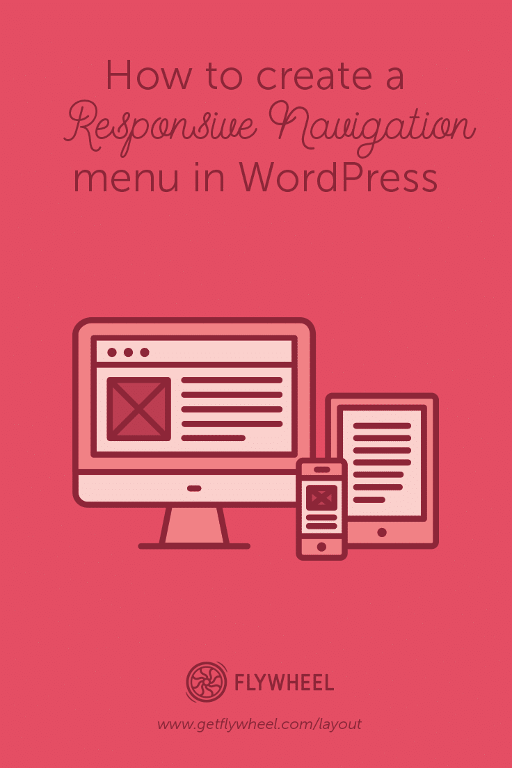
How to create a responsive navigation menu in WordPress
The road to creating a responsive navigation menu in WordPress is open-ended. There are countless ways to do this thanks to the flexibility offered by WordPress.
Today, I’ll show you how to create a lean and mean responsive navigation menu. Lean because we are going to achieve all this in under 8 kilobytes, and mean because it will be an incredibly efficient navigation menu. We are simply going to mirror your current navigation menu so that you don’t have to maintain two different ones. By killing two birds with one stone, we’ll create one menu to rule them all.
Before we start, we suggest you have some basic front-end development knowledge. (We only require familiarity and not proficiency, so please don’t panic.) Basic HTML, CSS, jQuery, and WordPress knowledge would be ideal. This is a beginner to intermediate tutorial, as it involves modification of WordPress theme files.
You will also need access to the following WordPress theme files:
functions.phpheader.phpfooter.phpStyle.css
Before making any modifications, please be sure to run a backup of your site, or test changes in a local environment first. You always want to have a way to revert to your original files.

We are going to use bigSlide.js, a tiny jQuery plugin for creating off-screen slide panels. On the plugin’s website, it is described as “a teeny tiny (~1kb compressed) jQuery plugin for creating off-screen slide panel navigation.” This is in line with our lean and mean responsive navigation goal.
Let’s get down to work.
1. Download the latest compressed version of bigSlide.js. Copy over the file into your theme’s /js folder.
2. Open functions.php in your preferred code editor. Search for wp_enqueue_script. You will likely see multiple instances, as wp_enqueue_script is the standard way of adding scripts to WordPress.
3. Just after the last instance of wp_enqueue_script, add the following snippet and save.
wp_enqueue_script( 'my-responive-menu', get_template_directory_uri() . '/js/bigSlide.min.js', array(), '20161214', true );
4. Open header.php, and add the class push to the first div just after the body tag. This section typically looks like this:
<body <?php body_class(); ?>><div id="page" class="hfeed site">.
So after adding you should end up with:
<div id="page" class="hfeed site push">.
5. While still inside header.php search for site-navigation. This will either be a class or an id depending on your theme. In most WordPress themes, it should look something like this:
<nav id="primary-navigation" class="site-navigation primary-navigation" role="navigation">
                <?php wp_nav_menu( array( 'theme_location' => 'primary', 'menu_class' => 'nav-menu', 'menu_id' => 'primary-menu' ) ); ?>
            </nav>
6. Add the following snippet just before </nav>. You should end up with this:
&amp;amp;amp;amp;amp;amp;lt;nav id="primary-navigation" class="site-navigation primary-navigation" role="navigation"&amp;amp;amp;amp;amp;amp;gt;
&amp;amp;amp;amp;amp;amp;lt;?php wp_nav_menu( array( 'theme_location' =&amp;amp;amp;amp;amp;amp;gt; 'primary', 'menu_class' =&amp;amp;amp;amp;amp;amp;gt; 'nav-menu', 'menu_id' =&amp;amp;amp;amp;amp;amp;gt; 'primary-menu' ) ); ?&amp;amp;amp;amp;amp;amp;gt;
&amp;amp;amp;amp;amp;amp;lt;a href="#responsive-menu" class="menu-link"&amp;amp;amp;amp;amp;amp;gt;&amp;amp;amp;amp;amp;amp;amp;#9776;&amp;amp;amp;amp;amp;amp;lt;/a&amp;amp;amp;amp;amp;amp;gt;
&amp;amp;amp;amp;amp;amp;lt;/nav&amp;amp;amp;amp;amp;amp;gt;
Here we are creating a hamburger icon that will be used to trigger the mobile menu.

7. Open footer.php and search for <?php wp_footer(); ?>. Just after this line, add the following snippet:
&amp;amp;amp;amp;amp;amp;lt;div id="responsive-menu" class="panel mobile-menu"&amp;amp;amp;amp;amp;amp;gt;&amp;amp;amp;amp;amp;amp;lt;?php wp_nav_menu( array('theme_location' =&amp;amp;amp;amp;amp;amp;gt; 'primary',) );?&amp;amp;amp;amp;amp;amp;gt;&amp;amp;amp;amp;amp;amp;lt;/div&amp;amp;amp;amp;amp;amp;gt;
&amp;amp;amp;amp;amp;amp;lt;script&amp;amp;amp;amp;amp;amp;gt; jQuery('.menu-link').bigSlide({
menu: '.mobile-menu',
speed: 300,
side:"right",
easyClose:true});&amp;amp;amp;amp;amp;amp;lt;/script&amp;amp;amp;amp;amp;amp;gt;
Basically, we are creating a hidden duplicate navigation menu on the footer.
8. Finally, open up style.css and just after the last line, add the following code snippet:
.panel{ position: fixed; right: -15.625em; width: 15.625em; background:#222;}
.push{position:relative;}
.menu-link{display:none;color:#fff;background:#333;border-radius:4px;padding:2px 12px;float:right;}
.mobile-menu a{display:block;color:#fff;padding:10px 15px;}
.mobile-menu a:hover{background-color:#555;}
.mobile-menu li{border-bottom:1px #444 solid;}
@media only screen and (max-width:900px) {

#primary-menu{display:none;}
.mobile-menu #primary-menu{display:block;}
.menu-link{display:inline-block;}
}
I have used a dark color scheme here, but feel free to change the colors to suit your needs.
This approach will work on almost all standard WordPress themes. But, due to the different use cases and header layouts out there, you may have to make a few adjustments.
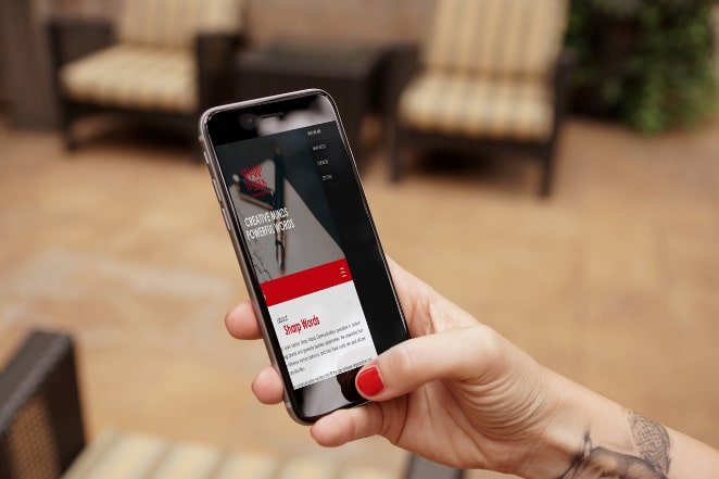
Ultimately, the fundamentals remain the same. The rationale is that on a screen size of 900px or lower, you’ll hide the default main navigation and show the hamburger icon instead.
On clicking or tapping the hamburger icon, the menu we duplicated on the footer opens up as an app like side panel.
If you happen to get stuck, please leave a comment below. I will be more than happy to help. Happy coding!
The post How to create a responsive navigation menu in WordPress appeared first on Layout | Creative content for designers, developers, & marketers.